
Team
Wilson Chen
Saideep Narendrula
Wonho Lim
Saideep Narendrula
Wonho Lim
My RoleS
Project Lead
User Research
Prototyping
User Research
Prototyping
Methods
Personas
Usability testing
User interviews
Iterative prototyping
Secondary research
Usability testing
User interviews
Iterative prototyping
Secondary research
Scope
Class project for Personal Health Informatics
End-to-end project
8 weeks (part-time)
End-to-end project
8 weeks (part-time)
THE MOTIVATION
Our team sought to use personal health informatics as a framework for addressing pervasive work challenges. We initially chose productivity as our main focus, then narrowed towards burnout after further ideation.
Initial Brainstorming

The six ideas on the right were the products of our team's initial project brainstorming session.
Each of us focused on two potential design spaces in detail.
We submitted our ideas to our instructor for feedback and were encouraged to expand upon the second proposal (highlighted in orange!) after balancing for impact and feasibility.
After discussion, we adapted our scope from productivity to burnout, while retaining the basic idea of the system.
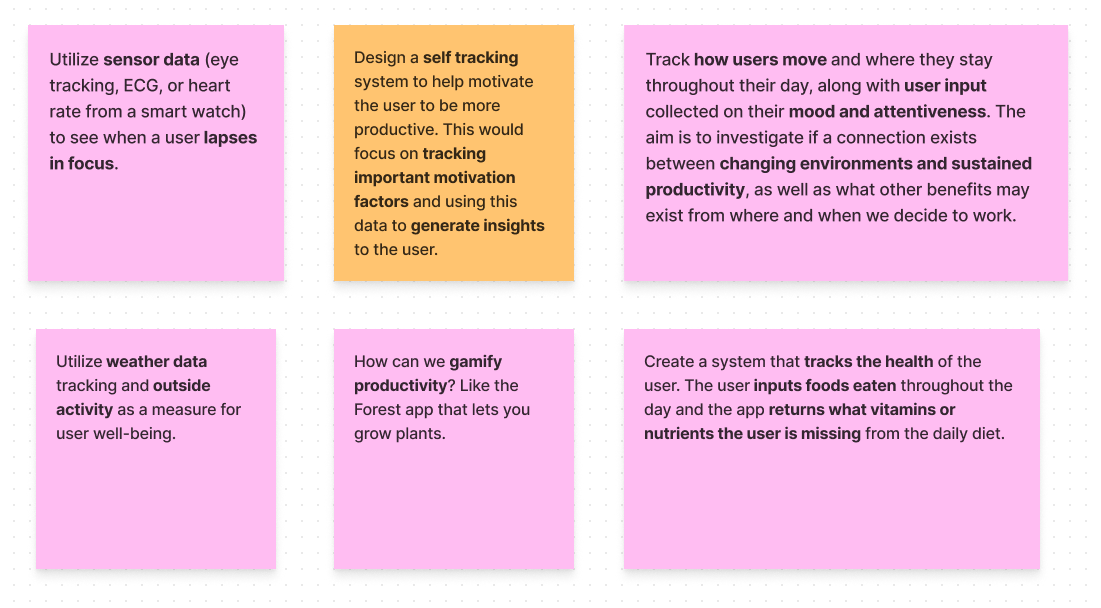
Ideations from our brainstorming session. We sought to incorporate some mode of personal data collection and output some kind of behavior change.
Our Goals
We landed on three primary goals for the design of our manual tracking system:
1. Minimize friction for user input.
Users who feel burnt out are unlikely to use a system that feels like a burden to use.
2. Support reflection-in-action.
We want to encourage users to reflect during the process of data input.
3. Support reflection-on-action.
We want to encourage users to reflect after the process of data input, typically in an aggregated form.
PRELIMINARY Research

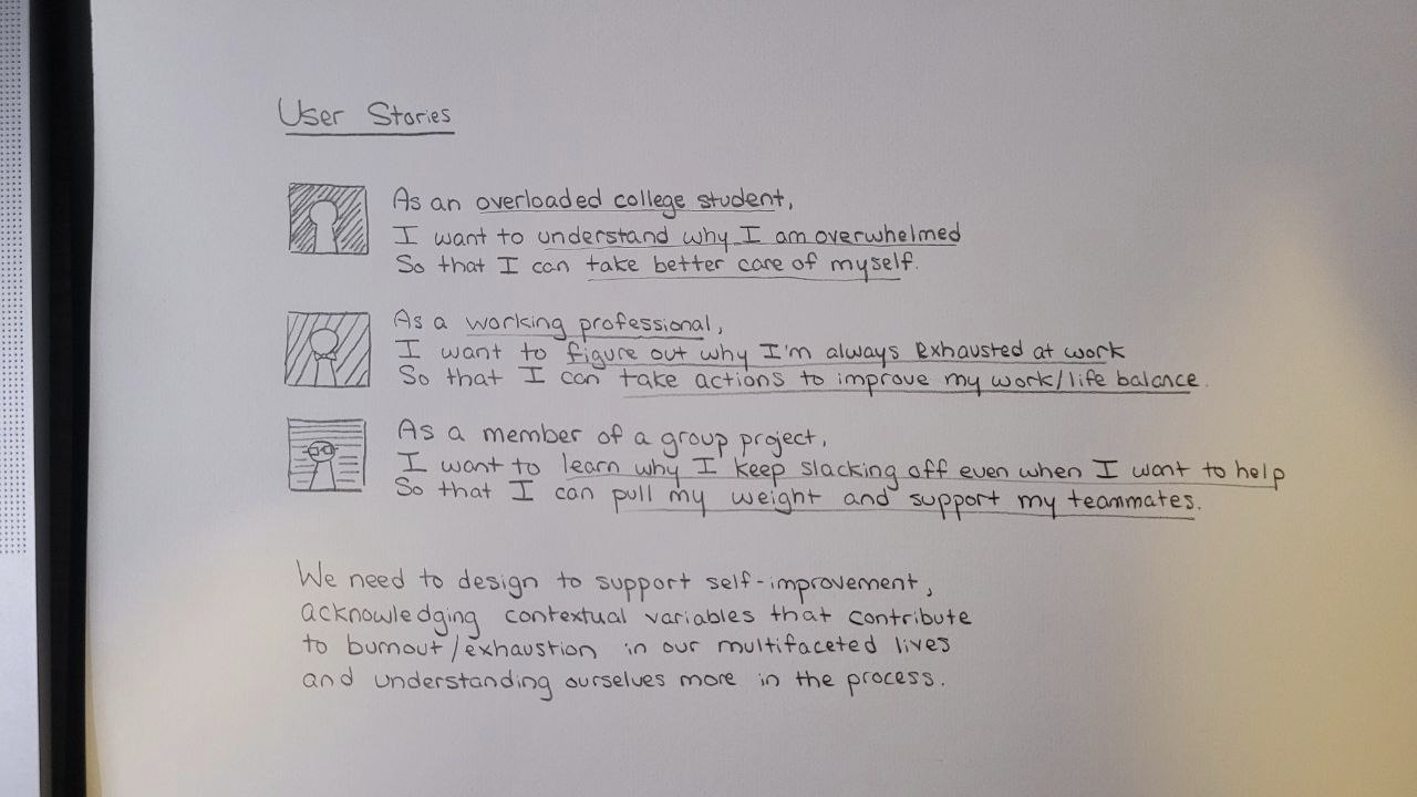
User Stories
We spoke with a few of our friends about their experiences with burnout in order to create the three evidence-based user stories shown in Figure 1.
Key Insight:
We need to design to support self-improvement, and acknowledge contextual variables that contribute to burnout in our multifaceted lives.

Journey Mapping
I mapped out a scenario from my personal experiences to understand steps that a burnt-out individual may go through.
During each stage, I ask how we can promote behavior change, coming up with five personal tracking considerations that are supported by our background research on burnout factors.
Key Insight:
We could break down predictors of burnout into five trackable dimensions: time management, nutrition, sleep, exercise, and habits.
Secondary Research
Here's what we found from reviewing the existing research:
Manual tracking has the pitfall of a high capture burden, but it best supports awareness and engagement over semi-automated or fully automated tracking (Choe et al., 2017).
Single-item surveys can reliably approximate burnout when compared to similar validated multi-item surveys like the Maslach Burnout Inventory (Dolan et al., 2015)
(Bruce, 2009) outlines strategies for reducing burnout - factors which mapped neatly to the tracking dimensions we independently arrived at.
Initial Design

We wanted to preserve the benefits of manual tracking (high awareness) to promote reflection-in-action, while minimizing the high capture burden associated with it.
We took advantage of the approximate reliability of single-item measures to simplify input. By doing this, we give up a degree of reliability. In exchange, we hoped this would tremendously reduce friction, one of our core design goals. Users know themselves best, which we believe will offset this tradeoff.
Five questions, five actions summarizes our user input design. Ultimately, our initial design was simple, but it was intended to be so. We gave it a moniker as the “snapshot” system of self-reporting.

Our first draft of the system design. Five questions, five actions.
Pilot Study

The System
We implemented a simple version of this design using a Google Forms survey.
Additionally, we added an optional “comments box” for users to write down context about why they chose a certain rating.
Recruitment
We recruited 5 users through convenience sampling.
Procedure
We instructed participants to fill out the survey once a day over a period of two weeks.
After two weeks, we reconnected with our participants and asked them about their experiences in an unstructured interview.

OUR Findings
Here's what we discovered from the pilot!
1. Participants sometimes forgot to complete a snapshot.
Design implication: Users need reminders and notifications.
2a. Participants often weren’t writing down their contextual factors in the comments box.
2b. When participants did write comments, they didn’t know how much they should write.
Design implication: Contextual comment input needs to be streamlined to minimize friction.
3. Users wanted to be able to see patterns and trends.
Design implication: aggregation of this raw data is needed to support reflection-on-action.
Iteration

For our final system design, I developed a medium-fidelity app prototype of our burnout system in Figma.
We used these three design implications we discovered in our pilot to iterate on our initial design.

Wireframes
The wireframes I created for our medium-fidelity app design are shown below.


Prototype
A board of the medium fidelity Figma prototype is linked here:
Usability Testing

Recruitment
We invited our initial 5 pilot study participants back to do a usability test of this new system with. We customized each participant's Figma prototype according to the data they submitted in the pilot, allowing them to reflect on their unique data points. Data about each participant is anonymized in the prototype embedded above.
Procedure
1/ Participants were given three scenarios and asked to complete a task in the prototype corresponding to scenario instructions.
2/ Each user was asked to talk out loud while we took notes on their thoughts and actions.
3/ Afterwards, we debriefed participants and conducted a short semi-structured interview.
Each researcher identified highlights from the conversation, and this data was qualitatively analyzed to identify insights from this iteration of the system.
FINDINGS

Reporting Screen
We found that our participants greatly appreciated the pre-generated sample responses as a way to reduce their cognitive load for self-reporting.
Furthermore, they were more likely to expand on their ratings instead of leaving them alone. This is important because these help contextualize good and bad days, and help deliver qualitative insights.

Summary Screen
We found that users generally appreciated the summary view of their personal results, and were able to extrapolate meaningful insights.
The visibility of missing data helped motivate people to be more aware of their reporting habits, although we note that this may incur unintended psychological consequences of guilt.

Insights Screen
Upon reflection, this was the weakest component of our system design. A participant reported the feedback as wordy and cluttered, and we see their point.
We note the failure of the feedback screen to provide useful information in a friendly interface as an area for further iteration.

Reflection
Ultimately, we were happy with the results!
We acknowledge areas with ample room for improvement like the insights screen. If we choose to continue this project, I believe we're well equipped with the knowledge to expand with another iteration.
We opted for rapid prototyping, which compromised a degree of visual design in exchange for faster results. I think there's validity in the statement that products that look pleasing to use will be used more, and that's certainly a limitation of this project.
UX is iterative by nature. Trying things out and identifying areas we can improve backed by evidence from user testing is something we've done twice(!) within the span of a class project. I'm proud of my team, and I'm proud of the experience we've gained from doing this project :)


