2FA Beyond the Basics: A Usability Study of Duo Mobile at the University of Washington
| YEAR | 2024 |
| ORG | University of Washington, HCDE · Duo Security / Cisco |
| ROLE | Researcher: Study Design, Recruitment & Survey, Analysis & Reporting |
| TYPE | Usability Study |
| DURATION | 10 weeks (Winter 2024) |
| TEAM | Wilson Chen, Bhoomika Bangalore Rajeeva, Candelaria Herrera, Anushka Kelkar, Gavriil Kochevrin |
| METHODS | Screening survey (n=23), moderated usability testing (n=6), think-aloud protocol, affinity mapping, severity rating |
| STATUS | Complete |
The Key Insight
Duo Security sponsored our team to study how UW power users (people who had linked five or more personal accounts) navigated the app. We couldn't find them. A screening survey of 23 UW respondents revealed that 39.1% didn't know they could link third-party accounts to Duo at all. The feature existed; the awareness didn't.
When we pivoted the study to test whether regular users could complete the account-linking flow, four of six participants failed. Three interlocking design problems made the flow nearly impossible for first-time users: missing context, inaccurate instructions, and a trust gap that turned a security feature into a perceived threat. We documented them, rated their severity, and delivered actionable recommendations directly to Duo's product team at Cisco.
My Role
On a five-person team sponsored by Vanessa Chien Lai at Duo Mobile / Cisco, I contributed across research design, execution, and synthesis. The table below maps what I specifically owned versus what was shared.
| Area | My contribution |
|---|---|
| Survey design | Co-designed the screening survey instrument, wrote question copy, and coordinated distribution through UW channels. |
| Study design | Contributed to the usability study plan and study kit, including task definitions and moderator guide. |
| Testing | Moderated usability test sessions with think-aloud protocol, audio recording, and post-task surveys. |
| Synthesis | Co-led affinity mapping of qualitative data and applied the HCDE 517 severity rating scale to classify findings by frequency, impact, and persistence. |
| Reporting | Contributed to the final study report and stakeholder presentation delivered to Duo's product team. Team point of contact was Gavriil Kochevrin. |
Context
Duo Security handles over one billion monthly authentications. At the University of Washington, it's the mandatory gateway for logging into Canvas, email, and every other institutional system. Nearly every student, faculty member, and staff employee uses it daily, but almost exclusively for one thing: approving the push notification when logging into a UW service.
Duo also supports a feature most users don't know exists: linking third-party personal accounts (Gmail, Instagram, Amazon) to use Duo as a general-purpose 2FA app. In HCDE 517: Usability Studies, our five-person team was sponsored by Duo Security to investigate how well UW users could discover and use that feature.
The research question Duo brought to us was focused on power users: people who had intentionally linked five or more personal accounts and were using Duo as a primary 2FA manager.
Original research question: How do power users interact with Duo Mobile's interface? How do they navigate when logging into several applications back to back, and how do they find the right passcode in a long list of connected services?
We couldn't find them. Survey recruitment across UW channels reached 23 respondents, and the data made clear why power users were rare: 39.1% of UW Duo users didn't know they could link third-party accounts at all. The feature's target user didn't exist in quantity because the feature wasn't discoverable.
Refined research question: Can regular UW users complete the third-party account-linking flow at all, and if not, what's stopping them?
This pivot became the study's first finding before testing even began. Designing for power users was premature when basic users couldn't complete the flow.
Method
The study ran in two phases over the Winter 2024 quarter, with findings delivered to Duo stakeholders at the end of Week 11.
| Method | Scope | Format |
|---|---|---|
| Screening survey | n = 23 | Demographics, Duo usage patterns, feature awareness, and usability test recruitment; distributed via UW channels over 9 days (Feb 16–25) |
| Usability testing | n = 6 | Moderated in-person sessions with think-aloud protocol, audio recording, and post-task questionnaires; 3 tasks per participant (Feb 25 – Mar 1) |
Phase 1: Screening survey
A Google Forms survey gathered demographic data, Duo usage patterns, and awareness of the third-party linking feature. The latter half invited interested respondents to sign up for a usability test session. We received 23 responses; 17 expressed interest in follow-up testing.
The survey also served double duty as a recruiting screener: participants needed to be UW-affiliated, actively using Duo in an academic context, 18 or older, and willing to use their mobile device during a session.
Phase 2: Moderated usability testing
We selected 6 participants from the 17 interested respondents and conducted moderated in-person sessions in booked campus rooms with audio recording (with consent). Each participant completed three tasks with think-aloud protocol and a post-task questionnaire (7-point scale for difficulty, perceived duration, and likelihood of continued use) after each:
- Task 1: Verbally walk through the process of logging into UW Canvas with Duo, step by step, without using your phone. (Mental model elicitation)
- Task 2: Actually log into UW Canvas using Duo on your mobile device.
- Task 3: Add two-factor authentication to a third-party service of your choice (Gmail, Amazon, Instagram, etc.) using Duo.
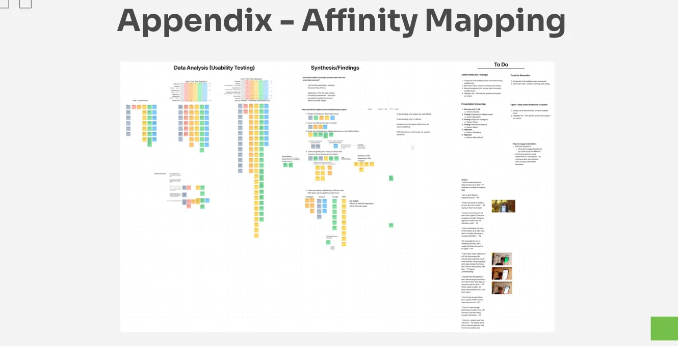
For analysis, we organized qualitative data through affinity mapping and applied the HCDE 517 severity rating scale to classify each finding. The scale uses three dimensions (frequency, impact, and persistence), each rated as moderate or serious:
- Severity 1 (Cosmetic): No serious dimensions; visually inconsistent but functional
- Severity 2 (Minor): 1 serious dimension, or 2–3 moderate dimensions
- Severity 3 (Major): 2 serious dimensions
- Severity 4 (Catastrophic): All 3 serious dimensions (common, hard to overcome, persistent)
Participants
Six participants: 4 students, 1 instructor, 1 employee. Four iOS users, 2 Android. Four women, two men. All were active UW Duo users in educational contexts.
Findings
Tasks 1 and 2 showed no usability issues. All 6 participants completed both at 100% success rate, and their mental models of the login flow (Task 1) matched their actual behavior (Task 2) exactly. Post-task ratings confirmed: participants found both tasks easy, short, and were likely to continue use. The standard authentication flow is well-understood and well-designed.
Task 3 was the opposite. The severity matrix tells the story:
| Cosmetic (1) | Minor (2) | Major (3) | Catastrophic (4) | Success Rate | |
|---|---|---|---|---|---|
| Task 1 | 0 | 0 | 0 | 0 | 100% (6/6) |
| Task 2 | 0 | 1 | 0 | 0 | 100% (6/6) |
| Task 3 | 0 | 0 | 0 | 3 | 33% (2/6) |
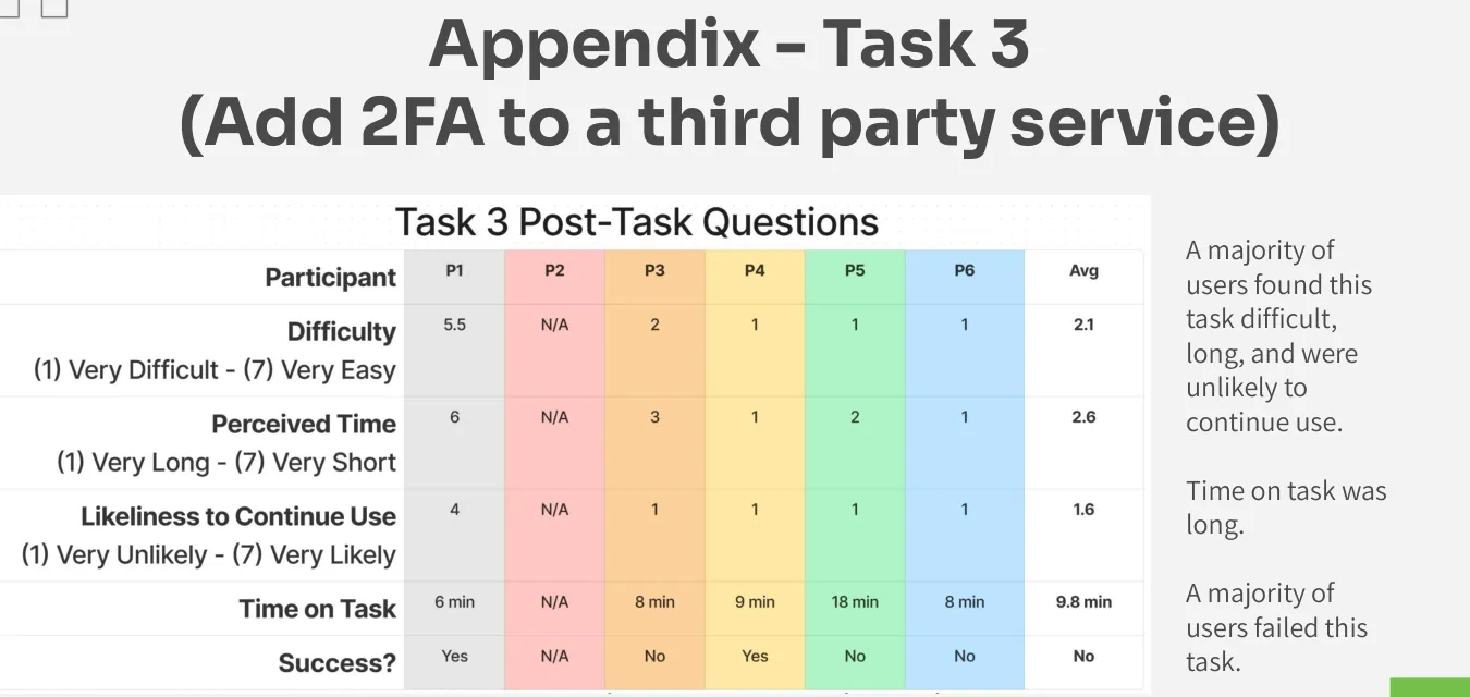
Average time on task for Task 3: 9.8 minutes. Range: 6 to 18 minutes. Post-task ratings were the inverse of Tasks 1–2: participants found the task difficult, long, and were unlikely to continue use. All three issues identified were rated Severity 4 (Catastrophic).
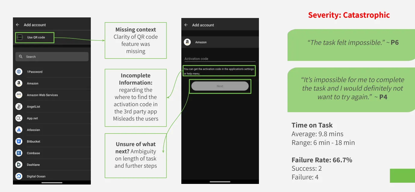
Finding 1: Participants couldn't complete the flow
The third-party linking process requires navigating between Duo and a target app, using either a QR code or an activation code to complete the connection. The interface provided no explanation of what a QR code was for in this context, no indication of where to find the activation code in the target app, and no progress signal of how many steps remained.
Participants would reach an impasse: the Duo screen showed a QR code scanner with a vague instruction to "go back to [app name]," and they had no idea where to go or what to do next. Without any path forward, most stopped.
"The task felt impossible." (P6)
"It's impossible for me to complete the task and I would definitely not want to try again." (P4)
Recommendations: Deep-link from within Duo directly to the 2FA settings page of the target app, eliminating the need for users to navigate through unfamiliar menus. Add a clear progress indicator to the linking flow so users know how many steps remain and where they are.
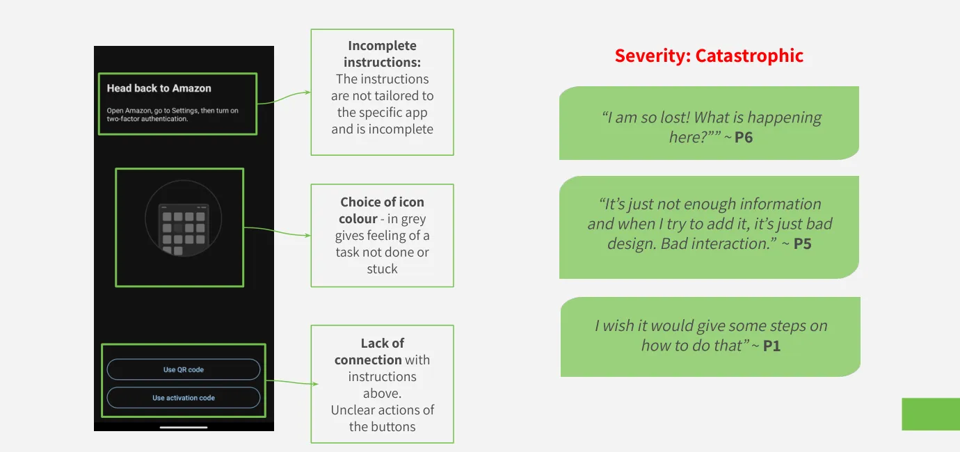
Finding 2: Instructions were inaccurate and generic
Duo's in-app instructions read "Head back to Amazon" regardless of which app the user was linking. For participants trying to link Gmail or Instagram, this instruction was not just unhelpful but actively misleading. The instructional copy had not been updated to reflect how different apps surface their 2FA settings, and the generic fallback created confusion about what step they were even being asked to perform.
A secondary issue: the "Use QR Code" and "Use Activation Code" buttons appeared side by side with no explanation of when to use each, and were rendered in gray, a visual treatment that communicated "inactive" rather than "available." Participants consistently hesitated, unsure whether they'd already made a mistake.
"I am so lost! What is happening here?" (P6)
"It's just not enough information and when I try to add it, it's just bad design. Bad interaction." (P5)
"I wish it would give some steps on how to do that." (P1)
Recommendations: Replace generic copy with app-specific instructions, including direct links to the relevant settings section of each supported service. Replace the gray icon treatment with instructional imagery showing exactly where in the target app users should navigate, with visual arrows. Clarify when to use QR vs. activation code with a single unambiguous decision point.
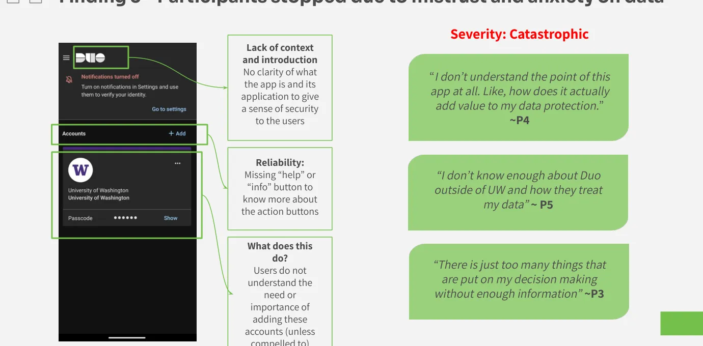
Finding 3: Participants were unwilling to proceed due to mistrust
Three of six participants believed Duo was a University of Washington application, built and operated by UW for UW purposes. When asked to link a personal Gmail or Instagram account to what they understood as a UW-controlled system, they refused or hesitated significantly. They didn't understand why Duo needed access to their personal accounts, what Duo would be able to see, or whether this was safe.
This wasn't irrational. Duo's interface provided no onboarding, no explanation of what the app is outside of mandatory institutional authentication, and no visible privacy or security information at the point of account linking. The absence of trust-building content turned a feature into a threat.
"I don't understand the point of this app at all. Like, how does it actually add value to my data protection?" (P4)
"I don't know enough about Duo outside of UW and how they treat my data." (P5)
"There are just too many things that are put on my decision-making without enough information." (P5)
Recommendations: Create a short onboarding sequence for new users explaining what Duo is, why it's trustworthy, and what it can and cannot access. Add inline "info" buttons at each decision point that explain what an action does before the user commits to it. Include a contextual reminder when users initiate account-linking that explains how the feature keeps their accounts safe.
Additional Findings
Several secondary observations from testing added nuance to the three main findings:
- The "Remember Me" feature felt non-functional to participants: several said they pressed it every time but still got prompted to re-authenticate repeatedly. Whether this was a bug, a misconfiguration, or a feature working as designed with low session persistence, the user experience was of a broken control.
- Participants who succeeded in Task 3 did not succeed independently: they required researcher hints, redirection, or initiated their own Google searches to find information Duo's interface didn't provide.
- Participants were confused about when to use QR code vs. activation code, leading to switching between phone and computer in ways that created additional confusion rather than resolving the impasse.
Outcome
The study results were delivered to Duo Security / Cisco stakeholders at the end of Winter 2024 in the form of a final report and a stakeholder presentation. The project was a course deliverable for HCDE 517: Usability Studies. Recommendations were delivered to the sponsor, but implementation decisions rested with Duo's product team.
What the research produced was a reframing of Duo's challenge: the original goal of studying power users revealed a fundamental feature awareness problem. The feature's target user doesn't exist in quantity because the feature isn't discoverable. Designing for power users is premature when basic users can't complete the flow.
The sponsor also identified areas for future research based on our findings: how users deal with authentication when they don't have their phone, what happens during phone switching or merging, and whether power users (once found) distinguish between Duo-endorsed apps and third-party additions.
Limitations
Our sample sizes (n=23 survey, n=6 usability tests) were sufficient for identifying usability problems (Jakob Nielsen's research suggests 5 participants uncover approximately 85% of usability issues) but limit generalizability of any quantitative claims. Survey respondents were self-selected through UW channels, which may skew toward more engaged students.
Sessions were run individually by different team members rather than together, which meant each moderator observed different user behaviors in real time without the ability to cross-check interpretations live. Earlier pilot testing would have helped; some ambiguities in the task wording only became apparent once participants encountered them.
A practical limitation surfaced during testing: because all participants were reluctant to link personal accounts to what they perceived as a UW app, the sponsor suggested creating a "burner" Duo account for participants to use instead. This didn't resolve the issue. Participants were then reluctant to add personal information to an account that wasn't theirs. The workaround itself became evidence of the trust problem we documented in Finding 3.
Reflection
The study's most interesting moment was the pivot. We designed a study for one user group and discovered mid-recruitment that the group barely existed, and that its absence was itself a finding. Reframing the study around first-time use rather than expert use was the right call, and it gave the sponsor more actionable data than a power-user study would have.
Delivering evidence-based recommendations with real user data to an active product team at Cisco was the kind of outcome that makes research feel grounded in something that matters.
Appendix
Project artifacts from the HCDE 517 course deliverables:
| Artifact | Description |
|---|---|
| Final Study Report | Executive summary, methods, findings with severity ratings, recommendations, and reflection |
| Stakeholder Presentation | Slide deck delivered to Duo Security / Cisco with findings, severity matrix, and recommendations |
| Usability Study Plan | Research questions, participant profiles, task list, data collection plan, and project timeline |
| Usability Study Kit | Recruitment survey, consent form, moderator guide, post-task questionnaire, and data logging plan |
| Preliminary Proposal | Initial heuristic evaluation and key usability issues identified before the study |