How could more people find a way to help?
Urban Recipe is an Atlanta food pantry that also runs a food co-op for low-income families. Members pay $4 and help package and distribute food, so the co-op depends on people showing up.
Its small staff had no one for technology or communications. The sign-up sheets and news on its website were out of date, and most publicity came by word of mouth.
My part of the research was the existing volunteer sign-up: I wrote its task analysis, a usage scenario that walks a new volunteer through it, and a critique of a comparable nonprofit’s volunteer page. Everything else was shared among the five of us.
Almost no one had heard of it.
- 15 of 16
- Had not heard of Urban RecipeSurvey respondents, mostly students, spring 2021.
- 11 of 16
- Preferred email for volunteer newsThe co-op already worked mainly by email.
- 2
- InterviewsA co-op representative, interviewed by our professor, and a student, interviewed by us.
Half the respondents rated the co-op’s social media presence very weak, and answers to a free-response question described trouble finding how to donate or volunteer.
The representative named lack of transportation and the risk of COVID as deterrents. The student added weekday class conflicts, and preferred the delivery sign-up, where open days were easy to see, to the preparation sign-up, which made people click each slot to check it.
The sign-up path I analyzed
In my usage scenario, Lorie sees a friend’s social media post and wants to deliver food. She finds the Volunteer button easily, hesitates at the sign-up form, then signs up anyway.
- 1Go to urbanrecipe.org
- 2Click Volunteer in the navigation bar
- 3Select Deliver Emergency Food Aid
- 4Complete the SignUpGenius form
Lorie hesitates here. The newest announcement is about the previous September’s slots, and she can find nothing about what a volunteer does.
- 4.1Download the informational files
- 4.1.1Download and complete the volunteer waiver
- 4.1.2Download and read the sanitation protocols
- 4.1.3Download and read the reference map
- 4.2Select an open date on the calendar
- 4.3Select Sign Up in the Available Slots column
- 4.4Enter name, email, phone, and vehicle information
- 4.5Select Sign Up Now
- 4.1Download the informational files
Ideas from a comparable nonprofit
I critiqued the volunteer page of Metro Ministries, a nonprofit in my hometown.
- Group volunteering. One person signs up a whole group, spreading the work across more people.
- Volunteer leaders. A longer commitment for people who want a larger role.
- A help-desk chat. Neither Urban Recipe nor the Atlanta Community Food Bank had one for common questions.
What the research asked of a design
- Outreach
- Raise awareness of the co-op.
- Recruitment
- Build a volunteer base.
- Inclusion
- Reach as much of the community as possible, across incomes and backgrounds.
- Safety
- Avoid unnecessary COVID exposure. Marginalized communities faced a higher risk.
Our usability goals, communication, convenience, efficiency, and inclusiveness, became criteria for choosing what to make.
Our matrix chose an outreach event. We built the app.
Each of us sketched eight ideas in eight minutes on a shared Miro board. We grouped them, wrote up five alternatives, and set aside a video ad campaign and a newsletter as too costly in money or upkeep for a small nonprofit. Three went into a weighted decision matrix.
School outreach event
A homeroom food-drive competition at a high school, with Urban Recipe merchandise for donors. It targeted the survey’s finding that few people knew the name, and over half of Fulton County public-school students qualify for free or reduced meals.
Mobile app
Sign up for events, refer a friend, and donate from a phone.
T-shirt
The co-op’s logo, mission, and social media links on a shirt for every volunteer. It raises awareness but is hard to connect to anyone signing up.
Weighted for a small nonprofit
Communication and cost carried the most weight: awareness was the problem, and a co-op with few staff could only carry out what it could afford.
We had named the trade-off before scoring. Online outreach loses people without devices or internet access; in-person outreach puts people at risk of COVID.
The app scored lowest of all three on inclusiveness.
| Criterion | Weight | Outreach event | Mobile app | T-shirt |
|---|---|---|---|---|
| Communication | 20% | 3 | 2 | 1 |
| Efficiency | 10% | 3 | 2 | 1 |
| Convenience | 15% | 3 | 2 | 1 |
| Inclusiveness | 10% | 3 | 1 | 2 |
| Scalability | 10% | 2 | 3 | 1 |
| Cost | 20% | 2 | 3 | 1 |
| Sustainability | 15% | 3 | 2 | 1 |
| Total | 100% | 2.7 | 2.2 | 1.1 |
Why we switched
- At the class poster session on March 29, Urban Recipe’s deputy director was most invested in the app.
- A real-world event “stretched the intended interpretation of a ‘user interface’” for a UI design course.
- Most of us were computer science majors, and an app fit our skills.
- Most of our survey respondents had phones and preferred to hear by text or email.
- In spring 2021, an in-person event meant COVID exposure; safety and location constraints “were a major bottleneck.”
The cost we named: an app “inherently has a disproportionate effect on accessibility for lower-income communities who may not have mobile devices or readily available internet access.”
Three tasks, each tied to a goal.
We built a high-fidelity Figma prototype around three tasks we could test.
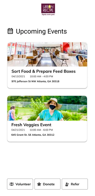
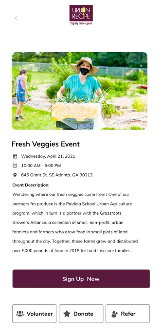
The calendar answered a complaint from our research: on the existing site, it was hard to see which slots were open. The prototype showed only what was available. Referral served our recruitment requirement through people who already volunteer.
Register for an outreach event
Goal: give community members an incentive to take part.
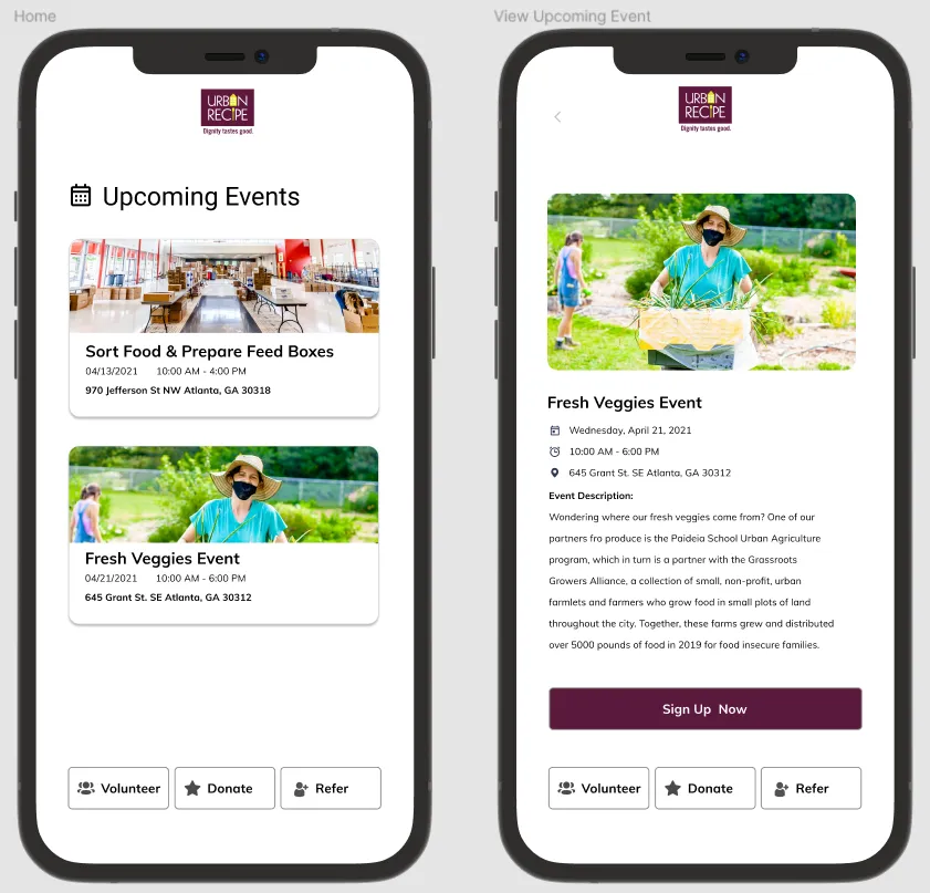
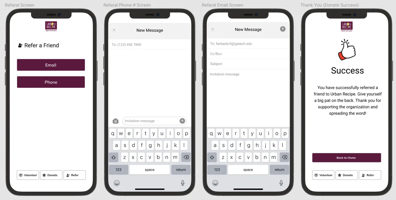
Refer a friend
Goal: build a stronger volunteer network through invitations.
Donate
Goal: reduce barriers to giving and volunteering.
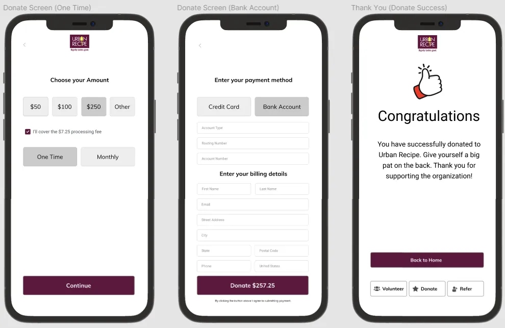
We tested three tasks with 10 students.
Over one week, each of the five of us ran sessions separately with Georgia Tech students, from one shared script, surveys, and evaluation tables.
In a pre-study survey, most participants were 18 to 22, used their phone at least a few times a day, had volunteered in the past year, and called themselves phone-savvy.
Each task started from the home screen. We counted clicks against the minimum each task needed, timed it, and noted what participants said as they thought aloud. Afterward they rated each task, the app overall, and how likely they were to return, each out of 5.
- 4.4
- Overall usability, of 5Post-study ratings, 10 participants.
- 3.9
- Likelihood of returning, of 5
- 9 of 10
- Referred a friend in five clicksThe fewest the task allowed.
| Task | Clicks | Seconds | Ease, of 5 |
|---|---|---|---|
| Register for an outreach event | 6.4 | 37.1 | 4.4 and 4.5 |
| Refer a friend | 5.1 | 22.9 | 4.9 |
| Donate | 6.5 | 27.2 | 3.9 |
-
Registering took longest; the calendar caused some of the confusion.
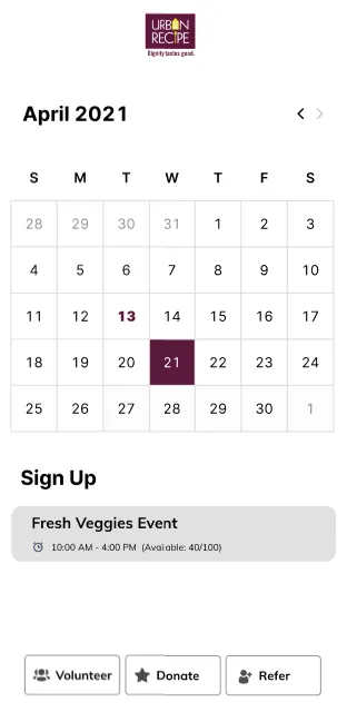
Figma prototype, spring 2021. We saw some confusion between outreach events and the regular volunteering options shown on the same screen.
Participants’ comments traced some of it, and most likely the extra time, to the calendar. One participant noted that it was possible to deselect the day and sign up for something unintended. One participant also suggested a better mark for event days than bold.
A common request was a more detailed description of an event before signing up.
-
Referral was the quickest task.
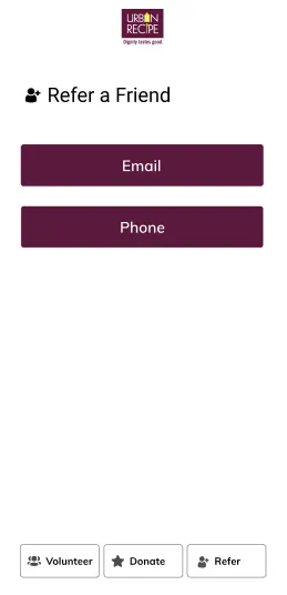
Figma prototype, spring 2021. It rated 4.9 for ease, the highest of the three tasks, and no one complained about finding it.
-
Donating raised a question.
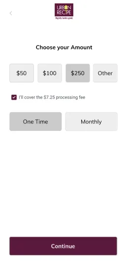
Figma prototype, spring 2021. Donating took the most clicks and rated lowest for ease, 3.9. A few participants said they would want to know how donations would be used.
Easy to use, with little reason to return.
Unless someone was already keen to volunteer or donate, we noted, the app offered no reason to come back.
We found flaws in our own protocol.
Participants registered and logged in at the start of every task. That step was not needed for the tasks, made click counts less accurate, and added confusion.
Our post-study survey asked about a feature for finding food locations that we never built or tested. A cognitive walkthrough, breaking each task into subtasks, would have checked every step systematically before we tested.
All 10 participants were students, most of them phone-savvy, and none identified as Hispanic or Latino or as Native American. We noted that a wider range of ages, education levels, and ethnicities would have been ideal.
We recommended five changes. The course ended there.
We did not revise or retest the prototype, and our reports record no handoff to Urban Recipe.
| What we observed | What we recommended | Who would act |
|---|---|---|
| A weak calendar markBold was the only mark for event days, and the day could be deselected. | Mark today’s date differently from event dates. | A future developer |
| Events and volunteering mixed upSome confused the two on one screen; a common request was more detail before signing up. | Show an event’s details before sign-up, on hover or in a detail view. | A future developer, with Urban Recipe staff for event descriptions |
| Questions about donationsA few participants wanted to know how their money would be used. | Say how donations are used. | Urban Recipe staff |
| An account firstEvery task began with registering and logging in. | Let people browse before creating an account, until they choose to volunteer or donate. | A future developer |
| No reason to returnLikelihood of returning averaged 3.9 of 5. | Gamify volunteering, with rankings and rewards for the most active volunteers. | Urban Recipe staff, with a future developer |
Looking back, we tested ease, not reach.
My reading now, not part of what we delivered.
Our research found an awareness problem. Every task we tested began with someone who already had the app open, so the test measured how easy signing up was, not whether the app would reach anyone new.
The one result that spoke to the original problem was likelihood of returning, 3.9 of 5.
A sample of phone-savvy students could not test the cost to lower-income communities that we had named.
Because five of us moderated separately and participants logged in at the start of every task, I would read the click and time averages as rough signals, not a fair comparison between tasks.
What I would test next: whether people who have never heard of the co-op find their way to signing up, with participants who are not students.