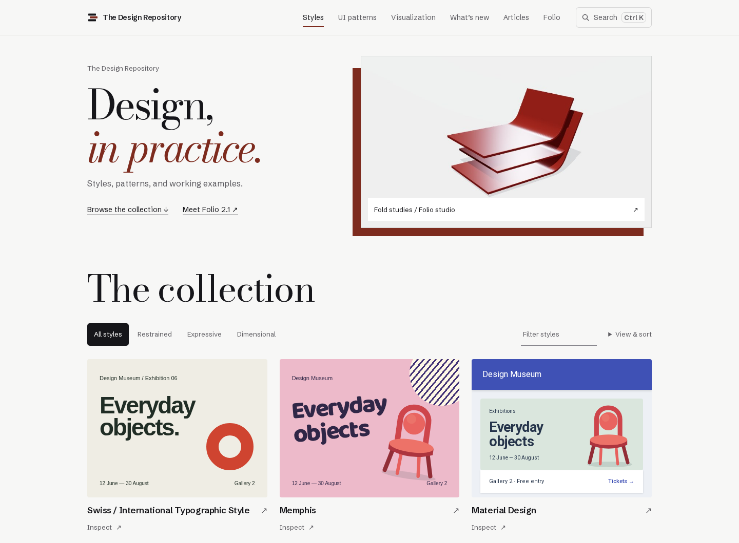
A reference I would actually use.
Style references online tend to be mood boards or listicles. I wanted one page per style that shows the style working, explains its rules, and cites its history, so I could choose a direction and then build it faithfully.
I wrote the audience down before the pages. The primary reader is a designer working in Figma, which is me, arriving with one of three jobs: discover a direction, keep up with emerging styles, or implement a style already chosen. The secondary reader builds interfaces by prompting AI tools and needs the concrete parameters, such as type scale, color roles, and grid, to keep a model from drifting toward generic output. The home page serves the first two jobs; the detail pages serve the third.
I directed the project and made the design calls. Most of the code was written with AI coding agents, which the commit history records.
Eight styles in a day.
On June 13 the first commit set up a Next.js site, a typed data model for a style, and a Swiss Style page as the template. By the end of the day the site had eight cited style pages, original visual specimens, and a static export.
Content is data: each style is one typed file with its sources, and the page template renders it. Every factual claim carries a citation, and the project’s rules require opening each source to confirm it says exactly what is claimed. Claims whose source could not be confirmed were softened or cut.
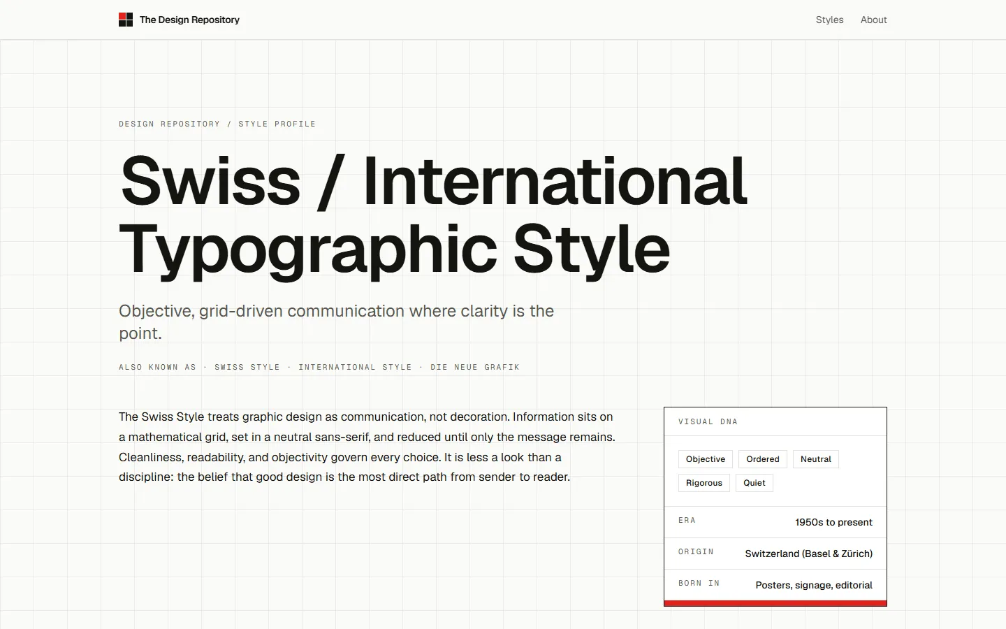
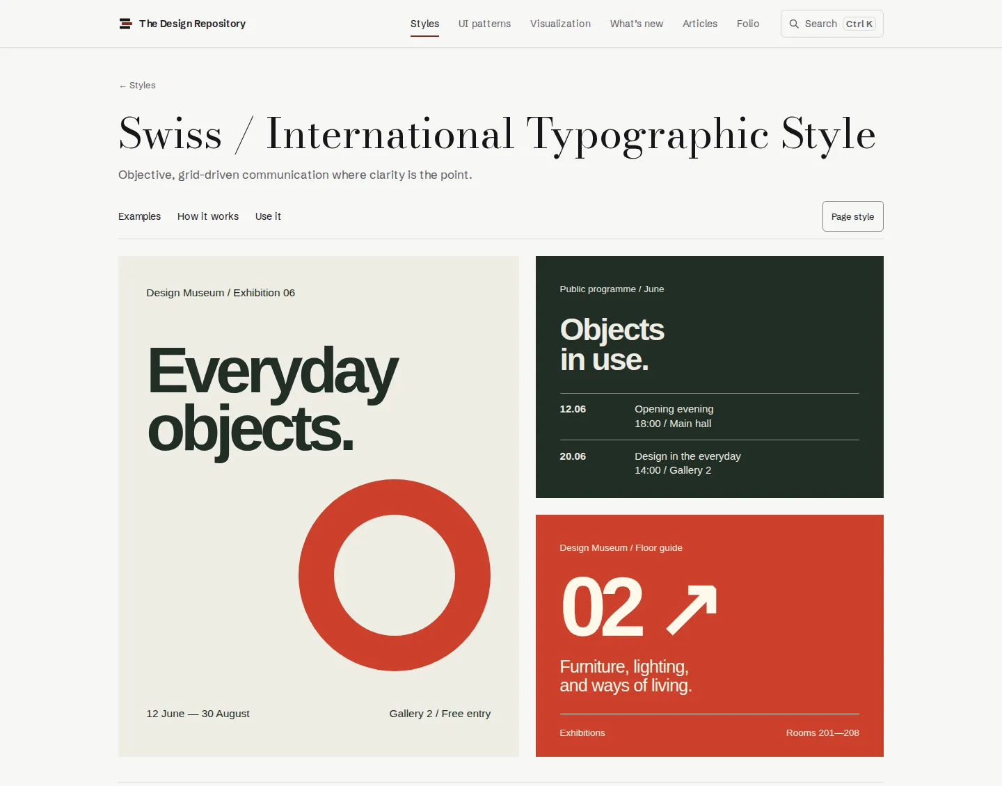
The home page, four times.
A neutral grid and a marketing headline gave way to a card grid, then a numbered index with a preview plate, then a gallery where every style renders the same museum poster, so styles can be compared directly.
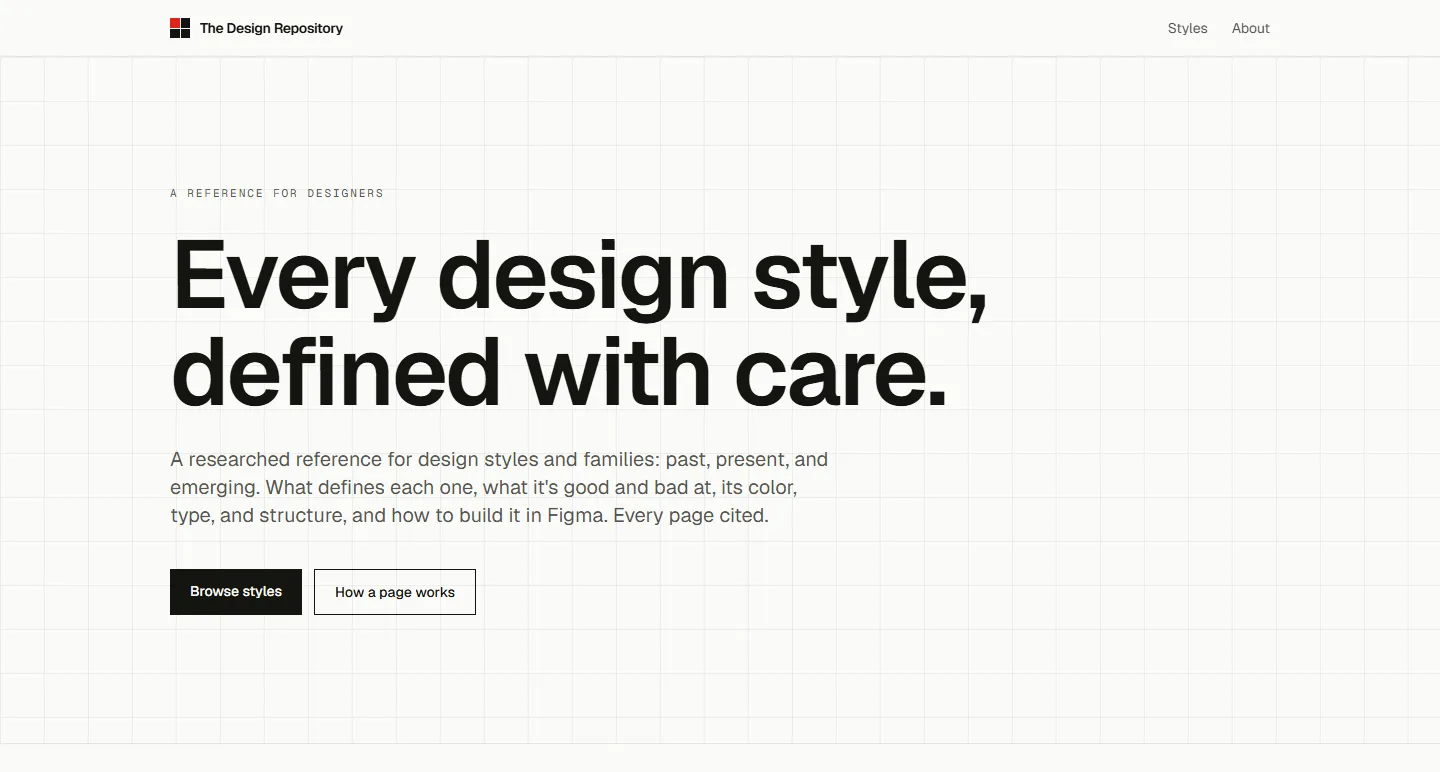
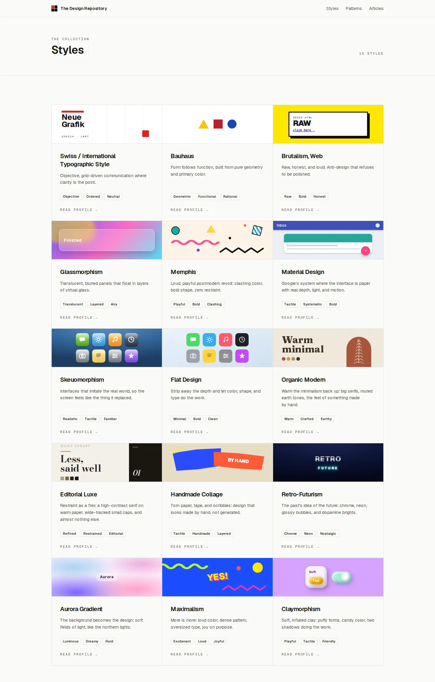
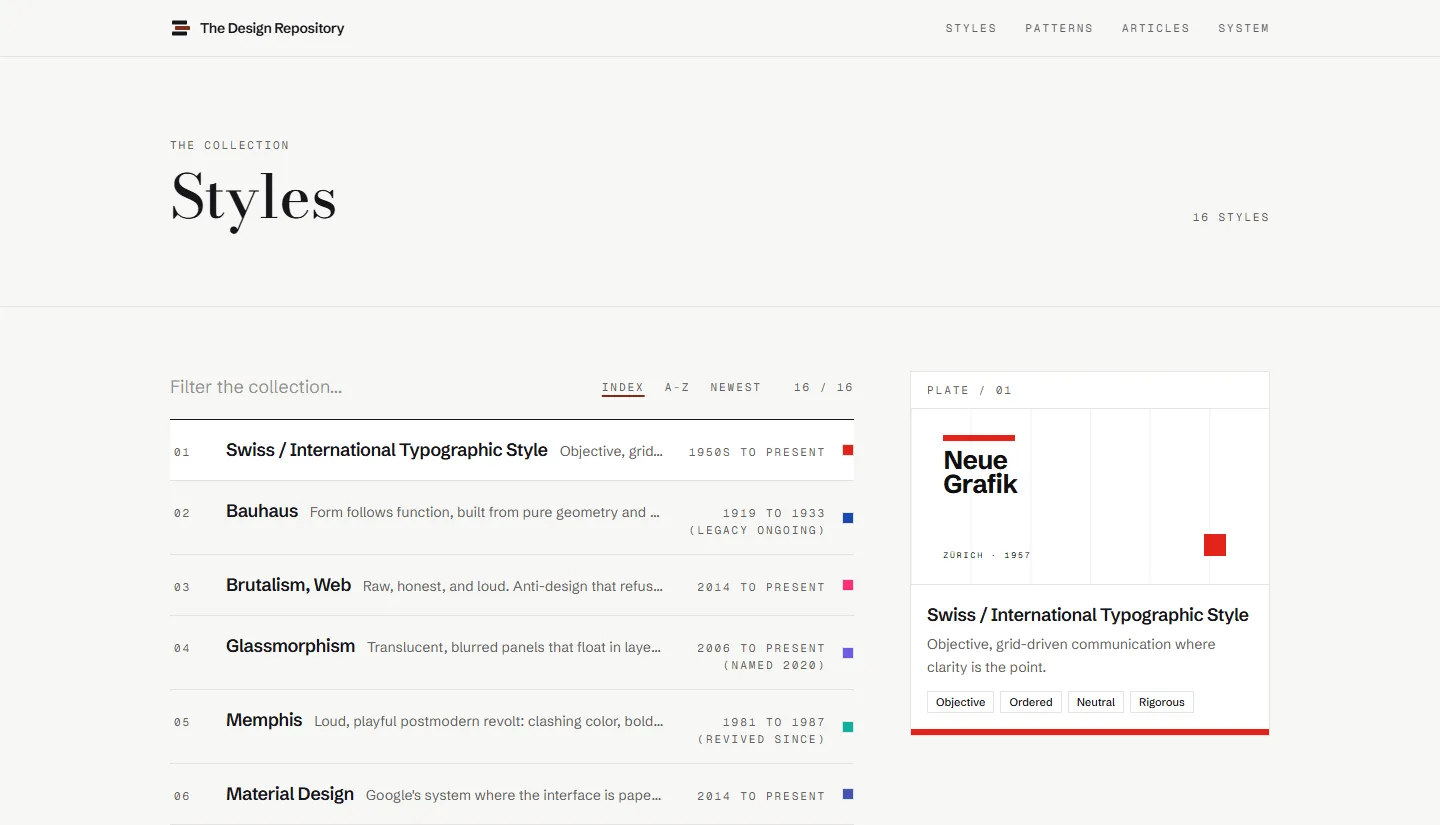
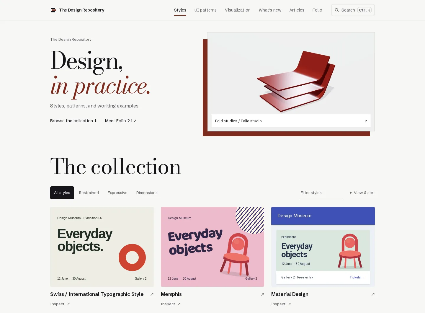
Show the style, then explain it.
The early pages led with prose and kept the examples lower down. I reversed that in July: detail pages now open on authored examples, and the research sits in collapsed sections below.
The examples are original demonstrations, never copies of existing work. Most styles share one subject, a museum exhibition, so the difference between Swiss, Memphis, and Material is the style and nothing else. Supported styles can also restyle the reference page itself, which shows the style holding up on a dense, real page instead of a single poster.
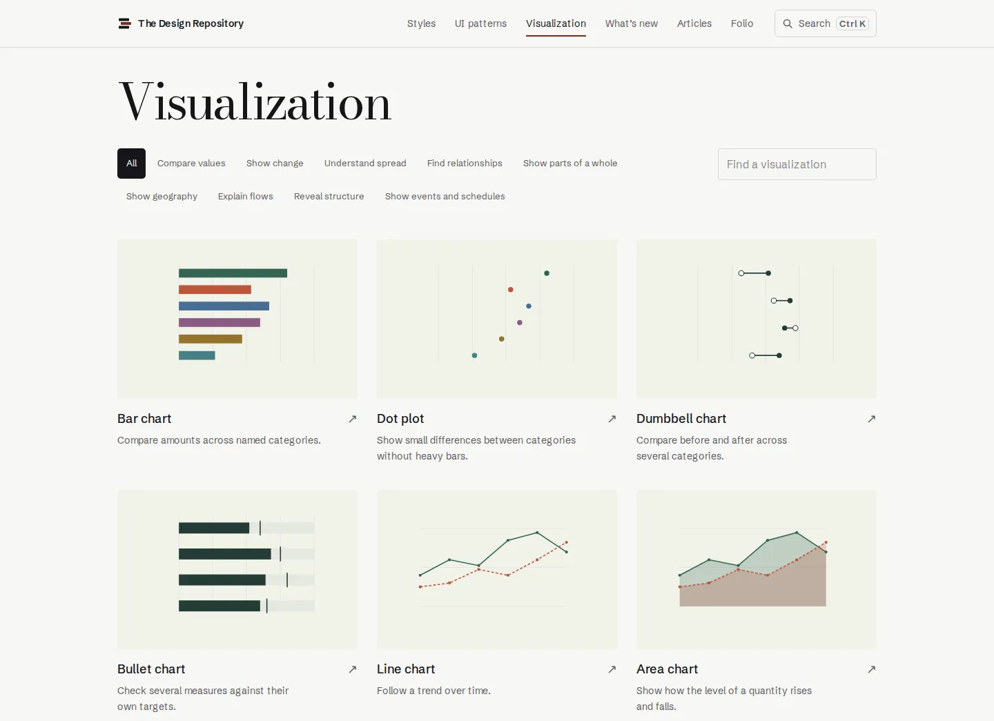
The pattern library followed the same rule. Each pattern page has a live specimen with keyboard behavior and real reference screenshots, and the visualization catalog is organized by the reader’s purpose, such as comparing values or showing change, rather than by chart name.
The writing went through two passes for tone. The first cut embellishment across every page; the second split the voice into one for articles and one for reference pages.
An identity of its own.
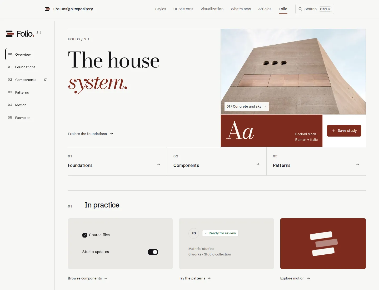
Until July the site borrowed a neutral Swiss look. On July 3 I gave it its own design system, Folio, and rejected the first version the same day: warm ivory paper and grain read as too yellow, and as a veneer over the same structure.
From a round of options I chose a split-view structure, a porcelain and graphite palette with oxblood for actions, and a sharp grotesk paired with a Didone display face. That version replaced the first before the day was out.
In September, Folio 2.0 became portable: canonical tokens with contrast checks, live component references, and a plain React app that proves the components work outside the site. Folio 2.1 added seven scannability rules, such as differentiating before adding space and stating a status once.
This site uses Folio 2.1, copied unchanged into its repository. Its type, color, and layout rules come from that work.
Where it stands.
As of October 11, 2026, the reference has 22 styles, 32 UI patterns, 28 chart types, and 7 articles, with site search across all of them.
The site is public and deploys from the private repository on every change. I have not tested it with other designers; the personas are my own working assumptions, and the reader they describe best is me.