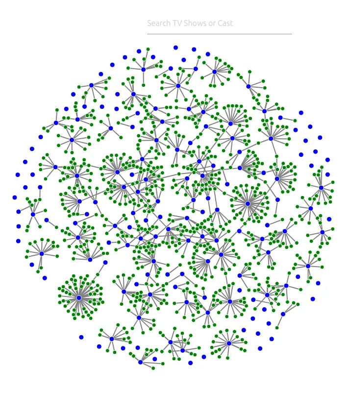
A visualization from an empty file.
The lab offered four options, each with its own dataset, visual style, and interaction challenges. I chose the network of U.S.-based Netflix shows and their casts.
The question the graph answers is who connects to whom: which shows share actors, and which actors cross between shows.
Each cast gathers around its show.
Shows are blue and cast members green; a line means “acted in.” Links pull each cast toward its show, a light repulsion keeps clusters apart, and collision spacing gives shows more room than people. Centering and a weak radial force hold the network in one disc.
Hover, search, then read the details.
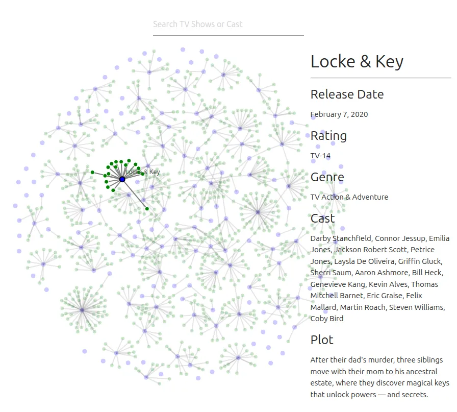
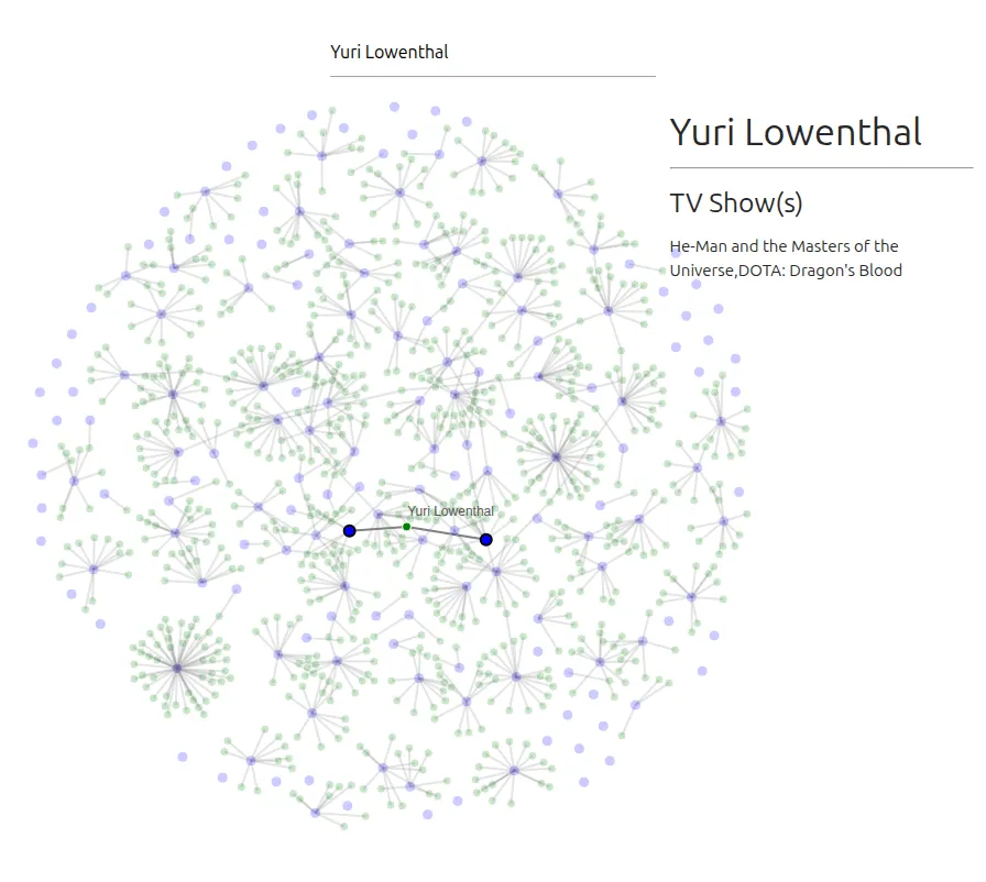
Hovering a node keeps it and its connections in full color, fades everything else, and fills a side panel. A show lists its release date, rating, genre, cast, and plot; a person lists their shows. The search field suggests every show and name, and selecting one does the same as hovering it. Nodes can be dragged, and a click on empty space resets the view.
Built for a lab screen.
The page assumes a large screen and a mouse; it was never adapted for phones. Its heading says 2020, though some release dates in the data are from 2021. The original is kept unchanged rather than corrected.